
Minimalism these days is the new trend in being sophisticated and elegant. It may be a user interface design or app design for the users.
The concept of minimalist UI design
Basically, when mobile app design is used, the user can maintain the structure of the page. It is because the user gets the necessary hierarchy design components.
With the help of minimalist UI design, the user can ensure to get a clear and innovative design.
Features of minimalist UI design
The minimalist UI design has so many traits that it is loved by most of the business persons. It helps them to analyze their web sites and provides them a chance to optimize their organizational objectives. In short, it supports them and makes them able to achieve their business goals and earn profits.
- The designs are three-dimensional. They have flat Patterns and textures.
- The minimalist UI designs help the user to improve the visual interest. And the best thing is that it is possible without even adding additional design.
- The user of the minimalist interface can get rid of the negative space of the webpage. The user only has to know the strong assertions before doing anything.
- The users will experience the use of typography. It is responsible for making the website visually more engaging. It has many font sizes and font styles.
- It prefers to use a grid layout to properly organize the content. It inserts designs brilliantly. Grids don’t require any additional design element.
How one can design minimally
Take into consideration, the following suggestions
- Proper intellectual activity: The very first step is to plan each and everything. The user has to plan about the color of the element, its contrast, its typography, its space, etc. The user has to have a prior idea of the end result. All in all, it is a matter of engaging the user through the app design.
- Selection made right: The colors play a very important role in the minimalist mobile app designs. Colors convey vitality. They can be used to communicate and to give feedback. They also contribute by helping people in visualizing data. And so, the user should choose the best color becomes very important in mobile app design.
- Usage of typography: The user has to understand the nature of typeface first. It is very important for him to know the reading style of people. The user has to devote some time in deciding the font type, font size, and space. The user should also choose the proper line length.
- Don’t underestimate white space: It is a mandatory element in a good design. It is very fruitful. But the only thing is that it should be used properly. It gives a clean and innovative look to the design. It is capable of getting the user’s attention. If not used properly, it will give adverse results.
- Images and icons: It is not compulsory to have images always. It will be suggested to use images only for a specific purpose. The user should use the image only if it conveys a message. It is a better option for replacing text. The same content applies to icons. They should not be used unnecessarily.
It is not that important to develop multiple minimalist mobile app designs. There should be proper user interaction. If the user succeeds in giving good experiences, he will succeed.
Some well-known minimalist UI designs
- Google Calendar:
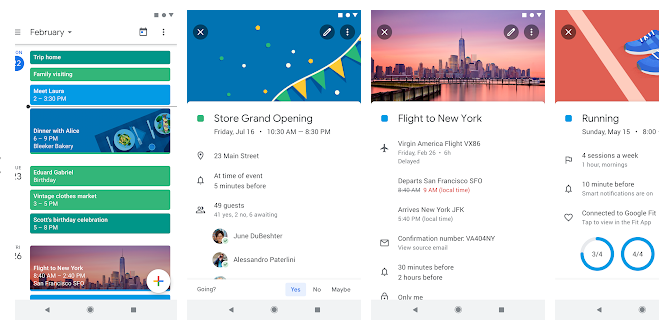
It comes with complex information. There is hardly any visual clutter found. It is obvious that many calendar apps are. But Google’s free app is the best of all. It is because it is very simple and easy.
- Twitter:
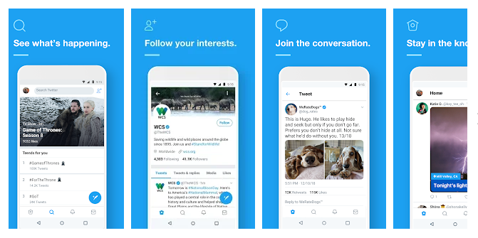
This social media handle has many well-crafted icons. All the icons differ in colors and styles. Twitter has proved that minimalism will look best even it is not simple. Its functionality is very complex. The user can use the app for a few activities only. The app is properly maintained.
- Google Drive:
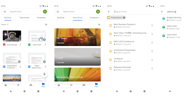
Earlier people used to spend a lot of money in order to track their business affairs. Google Drive has made everything easier now. It is a free service. It helps users to maintain their documents and spreadsheets. One can even share images and photos.
- Medium:
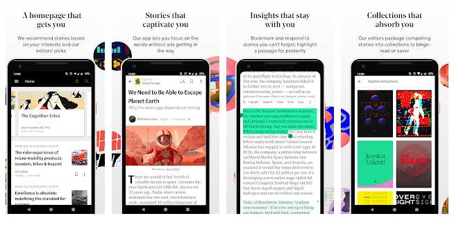
It is known to offer a good reading experience to readers. It has been developed in such a way that it gives an amazing experience. It is obvious that both readers and writers both will be satisfied. It allows the user to personalize the blog posts. Users appreciate its elegant and relaxed relax. They also get an enjoyable reading time.
- Shazam:

This has a simple interface. It can be used to do simple tasks. It has been designed keeping users in mind. And so its design is simpler as compared to other platforms. It has a complete description of it. So, it helps those who have no idea about technology or app design.
- Airbnb:
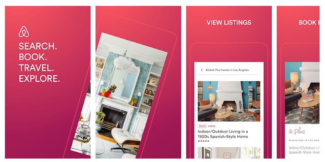
It is a very popular app. It has been redesigned recently. It has an easy to use interface. Airbnb provides ease to the process. One will definitely love its procedure. Its visual effect is astonishing. It balances the needs of customers. It makes them calm.
Epilogue
Presently, mobile app designing is an income generating sector. If it succeeds in giving a long-lasting first impression, then there is no limit to its success. With the help of minimalist UI design, it becomes easy to know the working of the mobile and the difference in the working of the mobile and desktop. Matellio has a record for developing various apps for the web as well s the mobile and can thereby help in developing a minimalist user interface.


