Back in 1971, when Closed Captioning was first demonstrated at the First National Conference on Television to enable hearing-impaired people to follow the content, no one had assumed its immense potential. Attempts at accessibility have always been the source of most significant innovations. Later, they become the luxury we all enjoy to make the lifestyles better and more convenient for all. This is why when ‘Look to Speak’, an ‘Experiments with Google’ Android app, was first launched for people with speech and motor impairments, it made all the headlines. Now that the app has again become the hot topic in the market because of its immense potential, we’re listing all you need to know when you want to invest in a similar mobile healthcare app.
What Is the Look to Speak App, And What Does It Do?
The Look to Speak is a free accessibility tool app launched by Google in December 2020. Since then, it’s been helping people with motor-deficit conditions to communicate the basic phrases much more conveniently. The app uses TensorFlow libraries for face and eye-movement detection. Therefore, whenever a user makes an eye movement, it takes that as an input to select a phrase and speak it aloud.
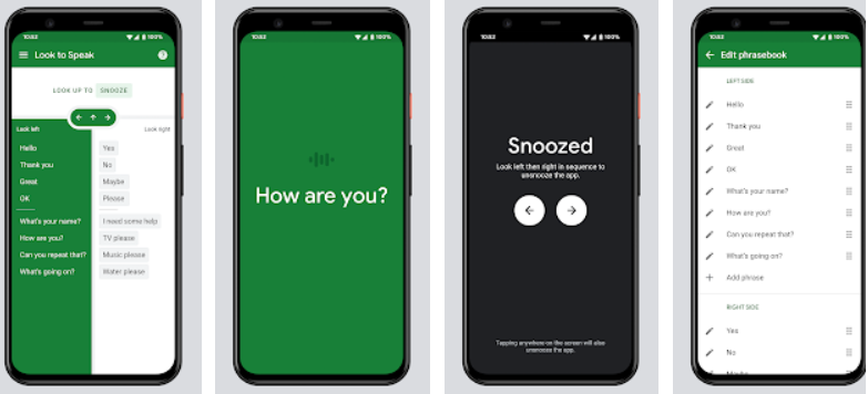
The running interface of the app is divided into four sections- left panel, right panel, top panel, and settings. The left and right panels are listed with ten common phrases each, out of which the user can pick one side to then narrow down the choices. Eventually, there will be only one phrase left on either side, which then the user can select through a similar eye movement, and the app will pronounce aloud.

Image Source
The top panel allows the user to snooze the screen, and you can find more about it later; it is the settings interface of the app that offers the most functionality. All those are also discussed further among the features.
Salient Features of Look to Speak App
With accessibility at its core, the Look to Speak app presents a range of features that make it easy for people with certain disabilities to communicate elementary commands with better ease. [/vc_column_text][/vc_column][/vc_row]
Features to Make Your Accessibility App Outstanding
Though the app Look to Speak by itself is quite revolutionary, you can make yours a bit better. Google’s product is still under experimentation, so this gives you time to bring your app with fuller features and steal the show in the present. Here are some features which can easily be developed to make your accessibility app more valuable.
Add More Gestures:
The Look to speak app is simply using eye movement for its functions. Instead, you can add more gestures like long eye-blink and shorter double-blink to make the app more functional for the intended users.
Settings Management:
The accessibility app is not completely controlled by eye movements. That means other than the phrase selection; the user has to tap on the screen to access settings; you can change that in your app to make it completely accessible.
Subtle Eye Movement:
Right now, the app is being critiqued for causing eye strain among users. You can easily avoid that by making your app gauge more subtle eye movements when making a selection from among the phrases.
Pictograms:
Using pictures or icons instead of words and phrases can allow your clone app to show more options to select from. Look to Feel doesn’t do that and hence limits the app’s usage to only English readers.
More Languages:
Though most people are aware of the common English language phrases, not all are. This is again where the accessibility app by Google misses its mark in making it more inclusive. You can overcome that by adding different languages in your own.
Voice Management:
Google has yet not added an option to change the accent and speed of the text reader in the app, even though it’s quite an easy feature to add. You can easily do that on your app to make it more engaging.
Font Resize:
The app doesn’t have an option to resize the font. This can limit its usage for people who prefer seeing words bigger or smaller than the default font size the app has chosen.
Make it Tablet-Friendly:
One of the most limiting factors of the Look to Speak app is the limited number of phrases it shows. With a tab-oriented interface, you can make your app more useful by showing more phrases to choose from at a time.
Developing a Healthcare Accessibility App Like Look to Speak
Look to Speak is still under experimentation. However, ever since its launch, it has managed to earn respect and trust from innumerable of its users. The pioneering concept of the app and its clear potential make it a great choice for people looking to invest in healthcare mobile app development. Here is a simple-to-follow guide on how you can develop a feature-rich clone of the aforementioned app.
Understand Your Target Audience
Since an accessibility app like Look to Speak is developed for a set and limited target audience, you will do no justice to your investment unless you spend time understanding your audience. You can hire professionals to draw insights for you or take help from volunteers to help you understand the viewpoint and problems faced by people with motor-deficit symptoms. This way, you will better understand all the features your app should actually have instead of just focusing on making a clone.
Pay Attention to Inclusivity
Not all people in your target audience are disabled similarly. Some of your users may have difficulty in moving eyes to extreme left and right, while others may have trouble keeping them focused on the center. So, before you even begin the development features, make sure that you’re keeping in mind the obstacles faced by all of them. In this stage, you can study how the Look to Speak app users find the app difficult to use. More market research can reveal all the solutions you can add to your app to make it more inclusive.
Develop Ideas for Personalization
Personalization is simplifying digital lives everywhere. From curated content on entertainment channels to preferred product categories on eCommerce, personalization improves the sellers’ user experience and revenues. Your accessibility app, too, can use some personalization concepts to take it a step ahead. The app can sort the phrases in order the users usually use them. The eye movement recognition can also be made to adapt as per the user’s preferences, so they neither strain their eye muscles nor do they pick the wrong phrase unintentionally.
Hire Machine Learning Developers
At the core of the Look to Speak app is TensorFlow Machine Learning logic for eye movement detection. So definitely, you’ll have to hire machine learning developers for its development. While hiring them, you can check or train their understanding of accessibility. The developers should know that even though the app is required to detect movement in the eyes, since motor-deficit conditions may not have easy movements in their eye muscles, they have to make certain special provisions. In case the user has involuntary and sudden movements in their eyes, the app must overlook those. While this can increase the complexity of the app development, the end result will be much more valuable.
Testing the Accessibility Features
Testing features for an accessibility app is rather different than testing most other features of a commoner app. The representative target audience here is too limited to understand and then solve their pain points easily. However, since the app is specifically built for them, it becomes essential that all the features are tested responsibly to ensure complete ease in use. For your app, you can take help from volunteers with motor-deficit conditions. Before handing over to the user testing, you, of course, will need proper QA engineers to test the functionality of the app.
Keep on Improving
If there is anything different about accessibility healthcare apps than their counterparts, it’s their endless potential for improvement. You can always make it a little better with the advent of newer technologies to make life easier for people with disabilities. In your Look to Speak clone app as well, you can use eye sensors to make a selection of phrases and even words much simpler. With strong enough sensors, users will only need to look at the word to type and then have them pronounced. You can even use AI to show personalized results among phrases, much like the autotype available in today’s smartphone keyboards.
Wrapping Up
Now we know that an app like Look to Speak carries an immense potential that can help millions of people around the world. Any tool or solution that can help humanity is worth all the investments, and if you’re ready to make that investment, here’s what you need to know. Though on the surface, the healthcare and accessibility app looks pretty simple, the involvement of complex Machine Learning algorithms can make the development process a little trickier than it has to be.
This is why if you’re all set to build an app similar to, or even better than, Look to Speak, you should always trust your concept with a reliable healthcare mobile app development company. A company that has ample experience in developing AI/ML solutions and understands the UX requirements of a truly accessible mobile application. Matellio is one such mobile app development company.
Our UX experts know what it takes to make an app truly accessible and inclusive. Furthermore, our years of experience enable us to create far more complex apps than Look to Speak. We know the target audience’s pain points and will be well-equipped to solve all those problems with your concept. And if you’re still confused about how it all will pan out, just fill this form to get a free call back from our consultants. They’ll guide you through the entire process, create an estimated timeline for your project and give you a free quote too.


